Photo Gallery – A modal Silverlight login user control.
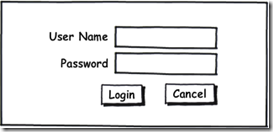
A common task in any application is to present the user with a modal dialog to gather additional information. The photo gallery uses a dialog of this type to allow the collection of login information. The following wireframe is the design for the login dialog that we want to implement:
How to implement this UI using Silverlight
Add a new Silverlight User Control to the photo gallery application and call it Login.xaml. Replace the XAML with the following:
<UserControl x:Class="PhotoGallery1.Login"
    xmlns="http://schemas.microsoft.com/winfx/2006/xaml/presentation"
    xmlns:x="http://schemas.microsoft.com/winfx/2006/xaml"
    Width="Auto" Height="Auto">
    <Grid>
        <Rectangle HorizontalAlignment="Stretch" VerticalAlignment="Stretch" Opacity="0.75" Fill="#FF8A8A8A" />
        <Border Style="{StaticResource DarkBorder}" Width="400" Height="160" BorderBrush="White" BorderThickness="1">
            <Grid Margin="30">
                <Grid.RowDefinitions>
                    <RowDefinition Height="Auto" />
                    <RowDefinition Height="Auto" />
                    <RowDefinition Height="Auto" />
                </Grid.RowDefinitions>
                <Grid.ColumnDefinitions>
                    <ColumnDefinition Width="Auto" />
                    <ColumnDefinition Width="10" />
                    <ColumnDefinition Width="Auto" />
                </Grid.ColumnDefinitions>
                <TextBlock Grid.Column="0" Grid.Row="0" Style="{StaticResource LightText}"
                            TextAlignment="Right" Text="User Name"/>
                <TextBox x:Name="UserName"
                         Grid.Column="2" Grid.Row="0"
                         Width="200" Margin="5 5"
                         HorizontalAlignment="Left"/>
                <TextBlock Grid.Column="0" Grid.Row="1"
                           Style="{StaticResource LightText}" TextAlignment="Right"
                           Text="Password"/>
                <PasswordBox x:Name="Password"
                             Grid.Column="2" Grid.Row="1"
                             Width="200" Margin="5 5"
                             HorizontalAlignment="Left" />
                <StackPanel Grid.Column="2" Grid.Row="2"
                            Orientation="Horizontal"
                            Width="200" Height="25"
                            Margin="5 5"
                            VerticalAlignment="Top" HorizontalAlignment="Left">
                    <Button Margin="30 0 5 0" Width="50"
                            Content="Login" Click="Login_Click"
                            />
                    <Button    Margin="5 0" Width="50"
                            HorizontalAlignment="Center"
                            Content="Cancel" Click="Cancel_Click"/>
                </StackPanel>
            </Grid>
        </Border>
    </Grid>
</UserControl>
The first thing to note is that the UserControl has the Width and Height properties set to “Auto”. This allows the control to automatically size to fit its contents. The Rectangle control has a grey fill with an opacity of 0.75 and has been set to “Stretch” in both the vertical and horizontal directions. This stretching will allow the rectangle to fill the container where the Login control is placed. This will provide the modal effect that we are looking for.
The Border element adds a little flare by defining a background color, border, and rounded corners. Most of the style of this element is defined in a resource placed in the App.xaml file. The DarkBorder sytle and others are implemented by the following code:
<application.resources>
    <style x:key="LightBorder" targettype="Border">
        <setter property="CornerRadius" value="10" />
        <setter property="Background" value="#FFDEDEDE" />
    </style>
    <style x:key="DarkBorder" targettype="Border">
        <setter property="CornerRadius" value="10" />
        <setter property="Background" value="#FF5C7590" />
    </style>
    <style x:key="DarkText" targettype="TextBlock">
        <setter property="Foreground" value="#FF14517B" />
        <setter property="Margin" value="5 5 5 5" />
        <setter property="FontSize" value="16" />
    </style>
    <style x:key="LightText" targettype="TextBlock">
        <setter property="Foreground" value="#FFDEDEDE" />
        <setter property="Margin" value="5 5 5 5" />
        <setter property="FontSize" value="16" />
    </style>
</application.resources>
The Grid child of the Border control defines the layout of the elements in the Login control. The control elements nicely define a region consisting of 3 rows and 2 columns. Once we have the Grid defined, elements are added.
Again, notice the use of the resource to define the style of the elements. This practice allows allows the style of elements to be separated and reused. It is analogous to using CSS with HTML.
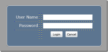
Below is the results of our efforts. Notice the grid lines are shown to help visualize the rows and columns. This should be turned off before deployment.
How to implement the login features.
So we have a UI, and now we need to ad logic to the button event handlers to make the features functional. We will again leverage the .asmx services that we developed for the HTML / JavaScript version of the photo gallery. The effort of creating this service layer is really paying off. The following code implements the features:
public partial class Login : UserControl
{
    public ServiceLayerProxy.ServiceLayerSoapClient Proxy { get; set; }

    public Login()
    {
        InitializeComponent();
    }

    private void Login_Click(object sender, RoutedEventArgs e)
    {
        string userName = UserName.Text;
        string passWord = Password.Password;

        Proxy.LoginAsync(userName, passWord);
    }

    private void Cancel_Click(object sender, RoutedEventArgs e)
    {
        Visibility = Visibility.Collapsed;
    }
}
First, notice the Cancel_Click event handler simply sets the Visibility property to Collapsed effectively hiding the dialog. The Proxy property allows the parent of this control to provide a proxy to the service layer. This proxy is utilized in the Login_Click event handler. All web service / WCF calls in Silverlight are asynchronous in nature. So somewhere we must attach a callback to the completed event for this call. This is done in our main page within the following code that creates and initializes the service proxy:
private void CreateProxy()
{
    // Create the proxy.
    //
    BasicHttpBinding bind = new BasicHttpBinding();
    string appUri = System.Windows.Application.Current.Host.Source.AbsoluteUri;
    int posLastSlash = appUri.LastIndexOf("/");
    string webUri = appUri.Substring(0, posLastSlash + 1);
    string serviceUri = webUri + "ServiceLayer.asmx";
    EndpointAddress endpoint = new EndpointAddress(serviceUri);
    _proxy = new PhotoGallery1.ServiceLayerProxy.ServiceLayerSoapClient(bind, endpoint);

    // Connect up service proxy events.
    //
    _proxy.GetThumbListCompleted += new EventHandler<photogallery1.servicelayerproxy.getthumblistcompletedeventargs>(_proxy_GetThumbListCompleted);
    _proxy.GetImageInfoCompleted += new EventHandler<photogallery1.servicelayerproxy.getimageinfocompletedeventargs>(_proxy_GetImageInfoCompleted);
    _proxy.LoginCompleted += new EventHandler<photogallery1.servicelayerproxy.logincompletedeventargs>(_proxy_LoginCompleted);
    _proxy.RotateCCWCompleted += new EventHandler<photogallery1.servicelayerproxy.rotateccwcompletedeventargs>(_proxy_RotateCCWCompleted);
    _proxy.RotateCWCompleted += new EventHandler<photogallery1.servicelayerproxy.rotatecwcompletedeventargs>(_proxy_RotateCWCompleted);
    _proxy.SetPrivacyFamilyCompleted += new EventHandler<photogallery1.servicelayerproxy.setprivacyfamilycompletedeventargs>(_proxy_SetPrivacyFamilyCompleted);
    _proxy.SetPrivacyPrivateCompleted += new EventHandler<photogallery1.servicelayerproxy.setprivacyprivatecompletedeventargs>(_proxy_SetPrivacyPrivateCompleted);
    _proxy.SetPrivacyPublicCompleted += new EventHandler<photogallery1.servicelayerproxy.setprivacypubliccompletedeventargs>(_proxy_SetPrivacyPublicCompleted);
    _proxy.DoSearchCompleted += new EventHandler<photogallery1.servicelayerproxy.dosearchcompletedeventargs>(_proxy_DoSearchCompleted);

    // Provide the proxy to the login user control
    //
    LoginPanel.Proxy = _proxy;
}
After creating the proxy there are callbacks wired up for a number of asynchronous completed service methods. One is the “LoginCompleted” and the callback is shown below:
void _proxy_LoginCompleted(object sender, PhotoGallery1.ServiceLayerProxy.LoginCompletedEventArgs e)
{
    if (e.Result == "Public")
    {
        // Login attempt was not successful.
        //

    }
    else
    {
        // Login attempt was successful.
        //
        LoginPanel.Visibility = Visibility.Collapsed;
        LogInButton.Visibility = Visibility.Collapsed;
        LogOutButton.Visibility = Visibility.Visible;

        if (e.Result == "Admin")
        {
            PrivacyOption.Visibility = Visibility.Visible;
            RotateCCW.Visibility = Visibility.Visible;
            RotateCW.Visibility = Visibility.Visible;
            _isAdmin = true;
        }
    }
}
The service checks the credentials and returns a simple token (string) indicating the access writes (Admin, Family, Public) of the individual. The callback then uses that information to hide / show certain features. For example if the user is successfully logged in then the login button is hidden and a logout button is made visible.
How do we use this control in the main page.
To use the Login control in our main page we first have to add a namespace definition and then define the control using XAML. The following code shows the important bits:
<?XML:NAMESPACE PREFIX = [default] http://schemas.microsoft.com/winfx/2006/xaml/presentation NS = "http://schemas.microsoft.com/winfx/2006/xaml/presentation" />
<usercontrol xmlns="http://schemas.microsoft.com/winfx/2006/xaml/presentation" xmlns:x="http://schemas.microsoft.com/winfx/2006/xaml" xmlns:j1="clr-namespace:PhotoGallery1" x:class="PhotoGallery1.Page" width="900" height="600">
    <grid width="Auto" height="Auto" horizontalalignment="Stretch" verticalalignment="Stretch" grid.row="1" x:name="LayoutRoot">
        <grid.rowdefinitions>
            <rowdefinition height="50"></rowdefinition>
            <rowdefinition height="*"></rowdefinition>
        </grid.rowdefinitions>
        <grid.columndefinitions>
            <columndefinition width="210"></columndefinition>
            <columndefinition width="*"></columndefinition>
        </grid.columndefinitions>

        ***** A bunch of other XAML that defines the page. *****

        <j1:login x:name="LoginPanel" grid.rowspan="2" grid.columnspan="2" visibility="Collapsed"></j1:login>
    </grid>
</usercontrol>
Notice the namespace that defines “j1”. Then the XAML for the login control defines the control to span all the rows and columns of our main page. This allows the Rectangle to fill the page creating the modal effect. The initial state of the control is set to “hidden” by the Collapsed visibility. The following two event handlers are wired up to login and logout buttons:
private void Login_Click(object sender, RoutedEventArgs e)
{
    LoginPanel.Visibility = Visibility.Visible;
}

private void Logout_Click(object sender, RoutedEventArgs e)
{
    _isAdmin = false;
    _proxy.LogoutAsync();
    PrivacyOption.Visibility = Visibility.Collapsed;
    RotateCCW.Visibility = Visibility.Collapsed;
    RotateCW.Visibility = Visibility.Collapsed;
    LogOutButton.Visibility = Visibility.Collapsed;
    LogInButton.Visibility = Visibility.Visible;
}
Initially, only the login button is visible. The click event of the login button causes the Login user control to be shown. This fills the screen. The user eventually clicks either the cancel or login button on the Login user control and the event handlers shown previously are triggered. If then the logout button become available. The logout click event simple resets the page.
Summary
Creating a modal dialog in Silverlight is pretty easy. I am sure there are other ways this could have been accomplished.


