Glossy Buttons with Paint.NET
Many times I have come across buttons on the web that look nice. Most of the time the buttons are the wrong color and I am forced to create my own. Then I usually Google for “glossy buttons tutorial”. There are many good ones using Photoshop, but not so many good ones for Paint.NET. I do not consider myself a designer or an artistic person, but it turns out that making a nice looking button is easy.
Note: In this tutorial I will be making a red, green and blue button simultaneously.
Hints:
- Remember CTRL-Z (undo) is your friend. Use it often.
- Use layers to separate the objects (OOP – Object Oriented Painting).
- All of the effects that we will add should be subtle.
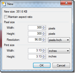
1. Create a New Image
Open Paint.NET and create a new image. Make the image size larger that the button you are trying to create. Later we will crop out the final button. I am selecting the 300×300.
 2. Delete the Default Background
Press CTRL-A (select all) and the press the DELETE key.
3. Draw the Button Base
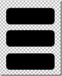
Select the ‘rounded corner rectangle’ tool. Draw a rectangle the desired button size. Configure to draw a filled shape with an outline. Choose any color as long as it is visible. I am using black for the primary and secondary colors. I am drawing rectangles that are 150×50.
4. Add a Color Gradient
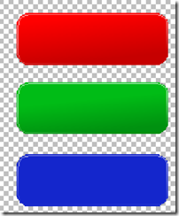
A color subtle color gradient creates the illusion of depth and lighting.
First select the area where the gradient will be applied. The easiest way to do this is to select the transparent pixels using the ‘magic wand’ and then invert that selection. Next add a layer to the image and name it ‘gradient’.
The gradient tool will draw a gradient between the primary and secondary colors that you select. The trick here is to select colors that will look good. Generally, it is good to be subtle and select the primary and secondary color to be color range. From a given primary color, use the slider bar for the ‘value’ in the HSV area of the advanced color selector to get a secondary color that is close and in the same color range. I am using the following colors:
| Button | Primary | Secondary |
| red | #FF0000 | #C60000 |
| green | #00BC16 | #009110 |
| blue | #0000FF | #1426CC |
Select the ‘gradient tool’ and configure it for ‘linear’ using the toolbar. Click around the bottom of the button and the drag up to the top. To get the effect that the page is lit from the top, put the lighter color on the top.
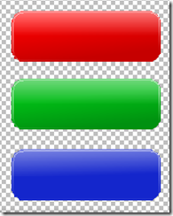
A nice touch that you see on many button is a bevel around the edge.
First select the area where the gradient will be applied. The easiest way to do this is to select the transparent pixels using the ‘magic wand’ and then invert that selection. Next add a layer to the image and name it ‘bevel.
Now select the ‘rounded corner rectangle’ tool and configure it for the following:
- draw shape outline (no fill)
- brush width 1
- fill of solid color
- anti-aliasing disabled
Draw a white border approximately one 2 pixels in from the edge in order to expose 1 pixel of the border gradient around the button periphery.
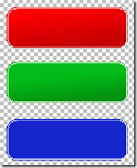 Now select just the border. The easiest way to do this is to use the ‘magic wand’ again. Ensure the ‘bevel’ layer is selected. Then set the selection mode to ‘replace’. Click in the transparent area outside the bevel. Then select the ‘Edit – Invert Selection’ menu option.
Select a primary color of white (#FFFFFF) with a transparency of 0 (fully transparent). Select a secondary color of white (#FFFFFF) with a transparency of 255 (fully opaque).
Select the ‘gradient’ tool configured for ‘linear’ mode. Click near the bottom of the button and draw about half way up. The bevel that we just created will disappear at the bottom and remain at the top.
Double click the bevel layer and set the transparency to around 140 to make the bevel more subtle.
This effect will create the illusion of a bit of shine. Remember the light source is at the top. So we want the top to reflect the light and create this shine.
First select the area where the gradient will be applied. The easiest way to do this is to select the gradient layer and then use the ‘magic wand’ to select the transparent pixels. Then invert that selection. Next add a layer to the image and name it ‘gloss’.
Now subtract away the lower half of the button. Do this by using the ‘rectangle select’ tool with a selection mode of ‘subtract’.
Select the same primary (transparent white) and secondary (opaque white) colors used in the previous step.
Using the ‘gradient’ tool click on the button horizontal mid-line and drag to the top. Don’t worry about the effect being too strong. Now double click
on the ‘gloss’ layer and set the transparency to make the effect more subtle. In my case I am around an opacity of 120.
5. Add Button Text (optional)
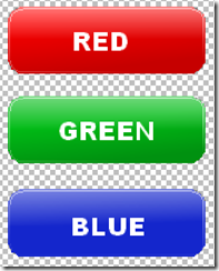
I generally like to create re-usable button images that do not include text. One reason for this is I like to add a CSS hover over effect to change the button color. But if you wanted, this would be the time to add your text to the button. This is a good idea if you want to utilize a font that may not be available on everyone’s machine.
Create a new layer named ‘text’. Select the ‘text’ tool, set the font, font size, and color. Add your text to the button.
6. Crop the Button and Save
Now that we have created the button, we need to save it as the correct size. First save the button as a Paint.NET file. This will allow you to maintain your layers if you ever want to go back and fine tune it. Then use the layers window to combine all the layers. Be careful when combining, the order matters when you have layers that are transparent. If you experience problems undo (CTRL-Z) them and re-order.
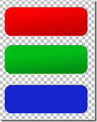
Use the magic wand to select the transparent pixels and then invert. Copy (CTRL-C) the image. Create a new Paint.NET image and paste (CTRL-V). Save the button as either a PNG or a GIF to support the transparent pixels.
Summary
Creating nice looking button backgrounds for you web pages is easy. This article is not the first one out there. I tried to capture ‘my’ recipe for creating these backgrounds using the tool that I have.


Thanks so much for this… I didn’t realise I that could do this in Paint.NET, my side-projects will look so much better now.