Silverlight Photo Gallery
I have been working on converting the photo gallery ASP.NET application to Silverlight. Previously the application relied on jQuery and a host of web services to deliver a rich user experience. The conversion to Silverlight has been very easy because of the previous implementation used these web services as a separation between the presentation layer and the rest of the application.
This blog pulls together the ideas explored in the following previous blogs:
- Photo Gallery – Silverlight Film Strip
- Photo Gallery – A modal Silverlight login user control.
- Create a Custom Silverlight Button.
Each of these developed a part of the photo gallery. The complete VS2008 solution can be found here.
Defining the application’s layout.
The following XAML defines the structure for the main application:
<usercontrol x:class="PhotoGallery1.Page" xmlns="http://schemas.microsoft.com/winfx/2006/xaml/presentation" xmlns:x="http://schemas.microsoft.com/winfx/2006/xaml" xmlns:j1="clr-namespace:PhotoGallery1" width="900" height="600">
    <grid x:name="LayoutRoot" grid.row="1" height="Auto" width="Auto" horizontalalignment="Stretch" verticalalignment="Stretch">
        <grid.background>
            <lineargradientbrush endpoint="0,1" startpoint="0,0">
                <gradientstop color="#FF6087FF">
                <gradientstop color="Black" offset="1">
            </lineargradientbrush>
        </grid.background>
        <grid.rowdefinitions>
            <rowdefinition height="50">
            <rowdefinition height="*">
        </grid.rowdefinitions>
        <grid.columndefinitions>
            <columndefinition width="210">
            <columndefinition width="*">
        </grid.columndefinitions>
        <!-- Top-Left: Button strip (navigational buttons) -->
        <!-- Bottom-Left: The image strip -->
        <!-- Top-Right: Button strip -->
        <!-- Bottom-Right: Main image area -->
        <!-- The 'modal' login user control -->
    </grid>
</usercontrol>
This XAML simply defines a 2×2 grid that can be used to position other controls. The page is sized to allow the Silverlight control to drop into the space previously carved out for the photo gallery. A gradient background has been added. The code for the commented sections define the controls for each quadrant. This is detailed below.
Top-Left Button Strip
![]() The top left corner contains a strip of buttons that allow navigation from the current folder to the previous folder or to the root folder. The image to the left shows these buttons. The following XAML defines this button strip:
The top left corner contains a strip of buttons that allow navigation from the current folder to the previous folder or to the root folder. The image to the left shows these buttons. The following XAML defines this button strip:
<stackpanel grid.row="0" grid.column="0" orientation="Horizontal" horizontalalignment="Stretch" verticalalignment="Top" margin="5">
    <hyperlinkbutton x:name="BackToRootButton" style="" click="BackToRoot_Click" tooltipservice.tooltip="Go to main folder.">
        <img source="/Images/back_to_top.png" margin="2" width="32" height="32">
    </hyperlinkbutton>
    <hyperlinkbutton x:name="BackOneButton" style="" click="BackOneFolder_Click" tooltipservice.tooltip="Go back one folder.">
        <img source="/Images/back.png" margin="2" width="32" height="32">
    </hyperlinkbutton>
</stackpanel>
The two HyperLinkButton are styled using a customized style.
Bottom-Left Film Strip
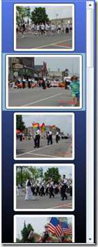
The image strip is created using a list box. A screenshot of the film strip is shown to the left. Most of this was created in an earlier blog entry. In that entry you will notice the images are all left aligned. No matter how hard you try you will never be able to get the images center aligned by using attributes in your XAML. The reason is that the default style defining the list box item has the horizontal alignment hardwired as “Left”. This is seen in the image below.
This screen shot comes from the Silverlight Default Style Browser tool created by David Anson. This is a great tool to learn how the default styles are created. This is especially useful when designing your own styles. In the above case, you can see that the “HorizontalAlignment” has been hardwired as “Left”. To get the centering that I desired, I created my own list box item style. The following XAML defines the film strip.
<listbox x:name="ImageStrip" grid.row="1" grid.column="0" height="550" selectionchanged="ImageStrip_SelectionChanged" verticalcontentalignment="Stretch" horizontalcontentalignment="Center" horizontalalignment="Stretch" verticalalignment="Top" background="Transparent" borderthickness="1" itemcontainerstyle="{StaticResource MyListBoxItem}" scrollviewer.verticalscrollbarvisibility="Auto" scrollviewer.horizontalscrollbarvisibility="Hidden">
</listbox>
Pretty simple. The thumbnails are loaded dynamically using a web service.
Top-Right Button Strip
The button strip has two modes: normal (top image) and admin (bottom image). The following features are provided:
- Search – The search feature finds images that have key words in their title and/or in their tag list.
- Play / Pause – The play features creates a slideshow effect using the images that are in the current film strip.
- Save – The current image can be downloaded and saved locally.
- Login / Logout – Provides access to features based upon roles (Public, Family, Admin).
- Rotate CW / CCW (admin only) – Sets the rotation for the current image.
- Public / Family / Private (admin only) – Sets the permission for the current image.
The backend for these features is provided by the web services that were developed and utilized by the HTML / JavaScript based version of the photo gallery application. The following XAML defines this area:
<grid grid.row="0" grid.column="1">
    <grid.rowdefinitions>
        <rowdefinition height="*">
    </grid.rowdefinitions>
    <grid.columndefinitions>
        <columndefinition width="Auto">
        <columndefinition width="*">
    </grid.columndefinitions>
    <!-- Search box -->
    <border grid.row="0" grid.column="0" style="" background="Transparent" horizontalalignment="Stretch" verticalalignment="Top" margin="15 5 5 0">
        <stackpanel orientation="Horizontal" horizontalalignment="Stretch">
            <textbox x:name="SearchText" width="150" margin="10 8 0 8" verticalalignment="Center"></textbox>
            <hyperlinkbutton style="" width="32" margin="0 8 10 8" click="Search_Click">
                <img source="/Images/search.png" margin="2" width="16" height="16">
            </hyperlinkbutton>
        </stackpanel>
    </border>
    <!-- Admin and non-admin buttons -->
    <stackpanel grid.row="0" grid.column="1" background="Transparent" orientation="Horizontal" horizontalalignment="Right" verticalalignment="Top" margin="0 5 5 0">
        <hyperlinkbutton x:name="RotateCW" style="" click="RotateCW_Click" tooltipservice.tooltip="Rotate CW" visibility="Collapsed">
            <img source="/Images/cw.png" margin="2" width="32" height="32">
        </hyperlinkbutton>
        <hyperlinkbutton x:name="RotateCCW" style="" click="RotateCCW_Click" tooltipservice.tooltip="Rotate CCW" visibility="Collapsed">
            <img source="/Images/ccw.png" margin="2" width="32" height="32">
        </hyperlinkbutton>
        <combobox x:name="PrivacyOption" verticalalignment="Center" width="100" visibility="Collapsed" selectionchanged="PrivacyOption_Changed">
            <comboboxitem content="Public">
            <comboboxitem content="Family">
            <comboboxitem content="Private">
        </combobox>
        <hyperlinkbutton x:name="PlayButton" style="" click="Play_Click" tooltipservice.tooltip="Play" visibility="Visible">
            <img source="/Images/play.png" margin="2" width="32" height="32">
        </hyperlinkbutton>
        <hyperlinkbutton x:name="StopButton" style="" click="Stop_Click" tooltipservice.tooltip="Stop" visibility="Collapsed">
            <img source="/Images/stop.png" margin="2" width="32" height="32">
        </hyperlinkbutton>
        <hyperlinkbutton x:name="SaveLink" style="" navigateuri="" tooltipservice.tooltip="Save">
            <img source="/Images/save.png" margin="2" width="32" height="32">
        </hyperlinkbutton>
        <hyperlinkbutton x:name="LogInButton" style="" click="Login_Click" tooltipservice.tooltip="Log In" visibility="Visible">
            <img source="/Images/lock.png" margin="2" width="32" height="32">
        </hyperlinkbutton>
        <hyperlinkbutton x:name="LogOutButton" style="" click="Logout_Click" tooltipservice.tooltip="Log Out" visibility="Collapsed">
            <img source="/Images/lock_x.png" margin="2" width="32" height="32">
        </hyperlinkbutton>
    </stackpanel>
</grid>
The admin level buttons are hidden / displayed based upon the current user role. This is done in the code behind page.
Bottom-Right Main Image Area
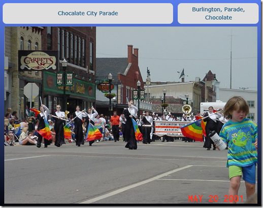
The main image area is where the larger version of the selected thumbnail is displayed. This area is shown below in “normal” mode (non-admin).
The image in this area is based upon the image selected in the film strip. At the top you see the image title (top-left) and the image tags (top-right). When you are logged in as an administrator, these static elements turn into entry boxes as shown below.
Changes to this data are sent to the server using the web services that were previously developed to support the HTML / JavaScript version of the photo gallery application. The following XAML defines the main image area:
<grid grid.row="1" grid.column="1">
    <grid.rowdefinitions>
        <rowdefinition height="55">
        <rowdefinition height="*">
        <rowdefinition height="30">
    </grid.rowdefinitions>
    <grid.columndefinitions>
        <columndefinition width="*">
    </grid.columndefinitions>
    <!-- Info boxes at the top of the image -->
    <stackpanel x:name="InfoAreaStatic" grid.row="0" width="680" visibility="Visible" orientation="Horizontal" background="Transparent">
        <border style="" width="440" margin="10 0 0 0" borderthickness="1" borderbrush="Transparent" cornerradius="10">
            <textblock x:name="Title" style="" textalignment="Center" horizontalalignment="Stretch" verticalalignment="Center" fontsize="14" textwrapping="Wrap">
                Select an image from the image strip on the left.
            </textblock>
        </border>
        <border style="" width="210" margin="10 0 0 0" borderthickness="1" borderbrush="Transparent" cornerradius="10">
            <textblock x:name="Tags" style="" textalignment="Center" horizontalalignment="Stretch" verticalalignment="Center" fontsize="14" textwrapping="Wrap" width="200">
            </textblock>
        </border>
    </stackpanel>
    <stackpanel x:name="InfoAreaEditable" grid.row="0" width="680" visibility="Collapsed" orientation="Horizontal" background="Transparent">
        <border style="" width="440" margin="10 0 0 0" borderthickness="1" borderbrush="Transparent" cornerradius="10">
            <textbox x:name="TitleEditable" margin="5 5 5 5" textalignment="Center" lostfocus="Title_LostFocus" horizontalalignment="Stretch" verticalalignment="Center" fontsize="12" textwrapping="Wrap">
            </textbox>
        </border>
        <border style="" width="210" margin="10 0 0 0" borderthickness="1" borderbrush="Transparent" cornerradius="10">
            <textbox x:name="TagsEditable" margin="5 5 5 5" textalignment="Center" lostfocus="Tags_LostFocus" horizontalalignment="Stretch" verticalalignment="Center" fontsize="12" textwrapping="Wrap" width="200">
            </textbox>
        </border>
    </stackpanel>
    <!-- Main image -->
    <border grid.row="1" background="Transparent" margin="5 0 5 5" height="500" borderthickness="1" borderbrush="Transparent" cornerradius="7">
        <img x:name="BigImage" source="" margin="5">
            <image.resources>
                <storyboard x:name="SlideShowTimer">
                    <doubleanimation duration="00:00:05.00" from="1" to="1" storyboard.targetproperty="Opacity" storyboard.targetname="BigImage">
                    </doubleanimation>
                </storyboard>
                <storyboard x:name="FadeOutImage">
                    <doubleanimation duration="00:00:00.20" from="1" to="0" storyboard.targetproperty="Opacity" storyboard.targetname="BigImage">
                    </doubleanimation>
                </storyboard>
                <storyboard x:name="FadeInImage">
                    <doubleanimation duration="00:00:00.20" from="0" to="1" storyboard.targetproperty="Opacity" storyboard.targetname="BigImage">
                    </doubleanimation>
                </storyboard>
            </image.resource>
        </image>
    </border>

    <!-- Footer area below the image -->
    <textblock grid.row="2" margin="0 5" verticalalignment="Bottom" textalignment="Center" foreground="LightGray">
        All content is © Copyright 2009, Bob Cravens
    </textblock>
</grid>
Summary
Converting the HTML / JavaScript photo gallery to a Silverlight photo gallery was a lot of fun and made super simple because Silverlight was able to leverage the same web services. This made the task really about replacing one UI implementation with another. A working version of the photo gallery can be found here:
The code for the project can be downloaded here.
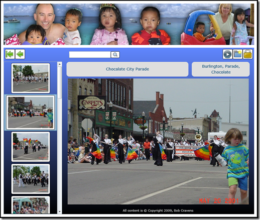
Here is an image of this version…


Great Article! Those tips and information happen to be easily worthwhile researching. You genuinely us valuable content. Thank you for sharing it!
Hi all, Need to thanks a lot often the autor of a blog. Most is evident combined with valuable. The structure could be wonderful to do. Could you delight phon all of us what is web theme do you really employ? appreciate it once more and thus go on the nice get the job done.
Wow! This blog looks just like my old one! It’s on a totally different subject but it has pretty much the same page layout and design. Superb choice of colors!