Simple Vertical Tabs
There are really two main ways (or a combination of them) to display menus on your web page: horizontally or vertically. Some sites have a combination of the two. For instance a main horizontal menu with vertically expanding sub options. All main menus are either vertical or horizontal.
Many sites have some form of horizontal menu selection across the top. Here are a few screen shots…
These three example represent one of the most common ways to provide a user a menu of options. The other way of presenting a menu is vertically. Here are a few screen shots…
At some point a menu containing too many options will not fit horizontally. Vertical menu are much better at expanding. Theoretically you can extend your vertical menu forever (please don’t do this though).
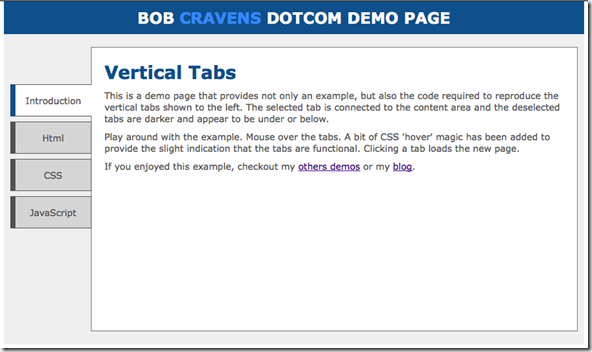
When displaying menu options vertically, it is very common to see lists of items. I wanted to add a bit of style to the menu option. This post introduces a page with simple / minimalistic vertical tabs. Here is a screen shot:
The demo page itself contains all the code (HTML, CSS, and JavaScript) that you need to reproduce the result. The demo page also contains a brief summary of the key points. In addition you have a live example of a page using the vertical tabs.
Summary
Check out the demo page for the code. If you have improvements or suggestions please leave a comment.


Hi there, I found your web site via Google while searching for a related matter, your site got here up, it appears to be like good. I have bookmarked it in my google bookmarks.
Hi,
I’m new to web development. I’ve tried your vertical tab example. I can get it to work apart from the jQuery selection. I’ve put the jQuery code into a .js file and referenced it in the html. Can you let me know exactly how to get the jQuery code to work please? e.g. where in the html should the code be referenced. Is anything else needed?
Thanks.
can you made it for wordpress plugin
ok I’m fairly adept at CSS but learning javascript (yes another newbie) and am having a total brain fart – what wording goes in the “main container”? I know you’re rolling your eyes and it’s something very simple, basic and obvious but could you take a sec to make it make sense to me? I get the rest (style sheet, Javascript, links, etc)
Nice Tutorial
hi rcravens,
I using WordPress. I have a problem is i want create a page with tabs style same with page here (tabs style vertical + icon) but my wp editor have not style tabs vertical: https://dreamtrips.com/trips/details/3940/discover-a-healthy-fit-you-
Can you help me..plz!
Wish you and your family all the best