Web Design Basics: An HTML & CSS Tutorial
Recently I was helping to introduce someone to web design. The person’s enthusiasm for learning about creating web content was apparent. He had already created a web site for his uncle. This content was created using one of those HTML generator applications. These tools are great for creating basic websites quickly. They usually fail pretty fast when the content becomes complicated. In addition, the HTML that is generated is typically less than desirable if you want to extend or maintain it.
Creating a web site is fundamentally simple. HTML, CSS, and JavaScript can be written using a simple text editor. Knowing a few ‘tricks of the trade’ can go a long way to creating a web site with a great user experience. During this post, we will develop a simple site and explore some ‘tricks’.
1. Gather Requirements
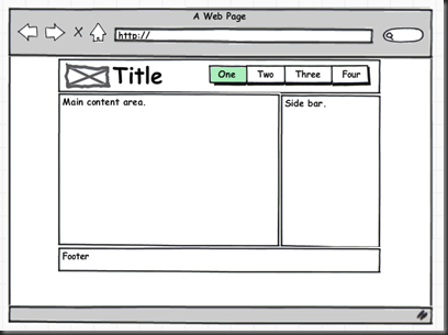
It is always a good idea to start with some requirements. It has been my experience that flushing out the macroscopic requirements before starting to code is a must. I then like to use an iterative approach to development. I create prototype #1 and discuss it with the customer. This leads to additional or refined requirements which I use to create prototype #2. This process is then repeated. The following image is captures the macroscopic requirements for the site we will develop. By the way the tool used to create this mock up is Balsamiq Mockups. Great tool!
 From the above image you can see the web page has a fairly typical layout. Header, footer, content and sidebar divisions are clearly visible.
Note: This tutorial will focus on getting the macroscopic layout. The detailed content will be unique for every website. This detailed content will not be developed here.
2. Select Your Development Tools
This will be determined by two things: the requirements and your skill set. I don’t want to get into a debate about which development tools are best. It really is not about the tools. The higher level scripting languages ASP.NET, JSP, PHP…etc all have there strengths. But once the page reaches the browser it is just HTML, CSS, and JavaScript. For a project that is more complicated, has a database, requires web services, or a business logic layer then select the tool that makes you productive, allows your company to maintain the code base, and delivers the product on time and within budget. In this example, we will be writing HTML, CSS and JavaScript.
3. Create the Website Project
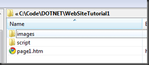
Organizing your files will go a long way in keeping your web site maintainable. In two years, you want to be able to come back and understand what you did. This may be a little overkill for this simple project. But it is good to be consistent and develop good habits. Here is the project layout I will be using.
 Generally sites have a lot of little images. These quickly clutter up your site. It is best to give them their own home. Same concept with scripts.
4. Create the HTML Markup
Now that we have our project, we can create the page. Here is the HTML for the body of our page:
<body>
    <div id="wrapper1">
        <div id="header1">
            <img src="images/logo.png" alt="logo" />
            <span id="title1">Title</span>
            <ul>
                <li><a class="active" href="#">One</a></li>
                <li><a href="#">Two</a></li>
                <li><a href="#">Three</a></li>
                <li><a href="#">Four</a></li>
            </ul>
        </div>
        <div id="content1">
            <div id="main1">
                main content
            </div>
            <div id="sidebar1">
                side bar
            </div>
        </div>
        <div id="footer1">
            footer
        </div>
    </div>
</body>
This content is semantic. All the divisions that were in our requirements are included in this markup. HTML5 will provide more meaningful tags for some of these elements. But until all browsers support the new tags this will do. Here is a demo of how the page looks.
5. Use CSS to Position and Style The Elements
As you saw in demo 1, the layout does not match the requirements. Let’s work on that a bit. Add a style sheet to the web page by adding a link element to the head tag as follows:
<head>
    <title>Simple Web Design</title>
    <link href="style1.css" rel="stylesheet" type="text/css" />
</head>
CSS stands for ‘cascading style sheets’. Styles are inherited by children elements (those contained inside others). This in effect allows styles to cascade down the element tree. CSS uses ‘selectors’ to determine which element is being styled.
CSS Reset
All browsers render content mostly the same, but there are differences. To help normalize the differences it is a good idea to practice some form of ‘CSS reset’. Ours will be very simple:
body
{
    margin: 0;
    padding: 0;
    background-color: #AAAAAA;
    font-family: "segoe ui",tahoma,verdana,"lucida grande","lucida sans unicode",sans-serif;
    height: 100%;
    color: #FFF;
}
Here we set the margin and padding to 0 for all elements contained in the body, add a little background color, set the font and height of the body.
Note: Adding a back ground color to an element is a great trick to let you visualize the elements boundaries as you position and size.
Page Width
The requirements specify a page width. Generally pages either flow (the content expands and repositions as the page is sized) or they are fixed width. If you select a fixed width, be sure to choose something that everyone will be able to see without horizontal scrolling. We will set our page width to 900 pixels and automatically set the left / right margins to center the wrapper element on the page.
#wrapper1
{
    width: 900px;
    margin: 0 auto;
    background-color: #000;
    border: solid 10px #FFF;
}
Logo, Title, Navigation
To layout the elements in the header element we will have a couple of options. We will use ‘floats’ to allow elements to be positioned. The following CSS positions the logo, title, and navigational menu.
#header1
{
    background-color: #FF8040;
    overflow: auto;
    padding: 10px;
}

#header1 img
{
    float: left;
    margin: 0 10px 0 0;
}

#header1 #title1
{
    float: left;
    font-size: 48px;
    font-weight: bold;
}

#header1 ul
{
    background-color: #FFF;
    float: right;
    padding: 0;
    margin: 10px 0 0 0;
    list-style-image: none;
    list-style-type: none;
    list-style-position: outside;
}

#header1 ul li
{
    float: left;
    font-size: 20px;
    margin: 5px;
}
First a bit of color and padding are added to the header division. The ‘overflow: auto’ style is used to ‘clear the floats’ for the logo, title and navigational elements. This allows the header div area to size to contain the child elements that are being floated. The image and title are floated left, the navigational menu list is floated right. Some additional margin, padding, and font-size styles have been added to the elements. Notice the default ‘bullet point’ style of the unordered list has been removed and then the list items floated left. This allows you to build a menu system from UL and LI elements.
Main Content Area, Side Bar and Footer
Once again, we will use floats to position our main content area to the left and the side bar to the right. The following CSS does will do the trick.
h3
{
    margin: 5px;
}

p
{
    margin: 10px 5px;
}

#main1
{
    float: left;
    width: 66%;
}

#sidebar1
{
    float: right;
    width: 33%;
    background-color: #FFAB84;
    color: #000;
}

#footer1
{
    clear: both;
    background-color: #FF8040;
    padding: 10px;
    color: #000;
    text-align: center;
}
First we globally styled all header 3 and paragraph elements. Then we float the main content area to the left and the side bar to the right. A key to doing this and having the page render how you expect it is once again ‘float clearing’. The footer element has a ‘clear: both’ style that clears the floats for all elements above it. This allows the page area to size to fit the content in the main and side bar divisions.
Note that I added some fake content to the main and side bar areas. A great generator for this content is Lorem Ipsum.
Interactive Navigational Menu
So far we have achieved the desired page layout. The navigational menu looks nice, but is really just a bunch of links. Let’s spend some time and make that look a little better. Again, we can use CSS to do this.
#header1 ul li a
{
    text-decoration: none;
    padding: 0 3px;
    color: #000;
    text-transform: uppercase;
}

#header1 ul li a.active
{
    background-color: #FFAB84;
}

#header1 ul li a:hover
{
    background-color: #FFAB84;
}
This CSS styles the anchor elements that are used to provide navigation in the unordered list that we have for our navigational menu. First the default style is set by removing the underline decoration, adding some padding, text color and transforming all text to upper case. Then the anchor with the ‘active’ class is set to have a background color. This provides the visual cue that this one is selected or active. Finally, we add background color on hover over with the mouse. This provides the visual cue that what is under the mouse is able to be clicked.
Summary
We now have a functional layout for a web site. Of course there is much more we can do. But this will start to depend upon the specific requirements. Building your own web site by writing HTML and CSS can be easy once you know some tricks of the trade.


useful info. thanks..soon html5 will take over the web 🙂
Thanks a lot for taking the time to share, Bye For Now Christopher