Building A Web App – Page Header and Footer
This is a continuation of a series of posts on the design and development of a web application for a non-profit organization. Previous posts:
At the end of the last blog post, we selected a color theme and created an HTML shell that laid out three main areas (header, content, footer). In that post, we also generated the default ASP.NET MVC solution and cleaned up various parts. In this post, we will begin designing the page header and footer. Before getting into the post here are screen shots of what we are working toward:
The actual content (logo, slogan) has yet to be decided. The purpose of this blog is to layout the elements that we know we want and incorporate the selected color theme. Some details will be filled in later.
Page Style
Before we get to laying out the header and footer there is some unfinished Cascading Style Sheets (CSS) business for the surrounding “page” element (see previous post) that we need.
.page
{
    width: 988px;
    margin: 10px auto;
    background-color: #fff;
    border-radius: 10px;
    -webkit-border-radius: 10px;
    -moz-border-radius: 10px;
}
This CSS sets the page width to 988 pixels, a margin of 10 pixels at the top and bottom, automatically centers the content left to right, and sets the background color to white. Why 988 pixels? There are many articles on selecting a page width on the internet. From Google’s browser size it looks like 80% of people will be able to see the full page content without horizontal scrolling. This statistic is also held up by Google Analytics data on visitors to this blog.
Also, notice that I am also using the CSS 3 rounded corners attribute (and the Mozilla / Webkit version). Rounded corners take the edge off (pun intended) of your web site and make it feel softer and friendly. Achieving rounded corners generally involves use of multiple images or using JavaScript to inject in a mess of HTML. YUCK! I have chosen to use the CSS 3 standard and ensure that IE still looks decent with square corners.
A lot of people like to use CSS grids to layout their web pages. Most web pages are not that complex. In these cases, I prefer to position the elements using CSS myself. If you have complex alignment and positioning needs, consider using a grid.
HTML = Drawing With Boxes
Laying out an HTML page is like arranging a bunch of rectangles on the page. In fact people generally refer to the HTML box model. I find it easier to layout the area thinking in terms of drawing boxes. In fact most designers will spend their time in a graphics tool like Photoshop and then the web page design “cut up” into HTML elements.
Here is the box layout for our page header design:
 The boxes are color coded so you can visualize the layout a bit better. There menu bar separates the header into a top and bottom. The top is further subdivided. Each colored box will contain other elements. The colored boxes are important to define the layout. Here is the HTML that defines the necessary colored boxes.
<div id="header">

    <div id="logo">
        logo
    </div>

    <div id="head-area-1">
        <div id="social">
            social / community
        </div>
        <div id="slogan">
            slogan
        </div>
    </div>

    <div id="head-area-2">
        <div id="links-search">
            links and search
        </div>
    </div>

    <div class="clear"></div>

    <div id="menucontainer">
        menu bar
    </div>

</div>
The HTML “div” is used to divide and area into logical divisions. We will apply some CSS magic to these HTML elements in a bit. For now try to mentally map each element to a colored box. Text has been added to the elements to aid in this mapping. There is one additional element that does not map to a colored box. The “div” with the “clear” class is an empty HTML element that clears the CSS floats (that we will talk about in a bit) so that the menu bar box will start on a new line.
Let’s use the same process to layout the page footer. The following is the initial design:
This time there are less boxes so the HTML will be even simpler. Here is the HTML for the footer:
<div id="footer">

    <div id="contact-info">
    </div>

    <div id="mission">
    </div>

    <div id="copyright">
    </div>
</div>
Notice that each element in both HTML code snippets has been given an ID. This ID will allow CSS (and jQuery) to select the element. This is important because CSS will be used to position each of the elements.
Using CSS To Position The HTML Elements
If you consider the box model again then generally HTML elements (boxes) are drawn from right to left and then top to bottom. There are two types of elements: inline and block. Multiple inline elements can fit on the same row. Once the row is out of space, the inline elements then wrap to the next row. Block elements take the whole line and only one can fit on any one line.
You can use Cascading Style Sheets (CSS) to change properties on HTML elements and effect how they render. For now we want to focus on positioning the elements on the page. With CSS you can change an element from an inline type to a block type. Elements can also be “floated” to the left or right. “Floated” elements are aligned either left or right and other elements flow or wrap around them. One of the best explanations on CSS floats was written by Chris Coyier of CSS Tricks.
The following CSS is used to position the elements in our header and footer regions. Keep in mind that we need more CSS to style the elements to look like the final images shown at the top of this post. The CSS elements for positions and sizing are being emphasized below.
#logo
{
    float: left;
}

#head-area-1
{
    float: left;
    margin: 0 0 0 10px;
    width: 292px;
}

#head-area-2
{
    float: right;
    margin: 3px 3px 0 0;
    width: 500px;
}

#links-search
{
    float: right;
}

#contact-info
{
    float: left;
    width: 30%;
}

#mission
{
    float: left;
    width: 70%;
}

#copyright
{
    clear: both;
    text-align: center;
}

.clear
{
    clear: both;
}
In the above CSS, the “logo” is “floated left”. This allows all the other elements to wrap around this element. Notice we also “floated left” the “head-area-1”. This will abut this element next to the logo. To finish up the header area the “head-area-2” element is “floated right”. This element (links and search) is positioned as far right as possible. The “float: right” style for the “links-search” element allows the content within the “head-area-2” to be right justified.
To get the menu bar to appear on its own line, the floats have to be “cleared”. This positions the next element below the floated elements on the next available row. An empty “div” with the “clear” class is used to to accomplish this in the header.
The footer elements use a similar approach to positioning. The “contact-info” element is “floated left” as is the “mission” element. The “copyright” element clears the floats within its own style so it appears on the next available row.
One of the best tools to figure out what each style means is to use a web development tool in your browser of choice. I really like Firebug for this purpose. These tools allow you to turn off any CSS rule while watching the effect live in the browser.
Header Details
We have the header elements (boxes) positioned and sized. Now it is time to fill in the details. The following is the complete HTML used to render the elements of the header:
<div id="header">

    <div id="logo">
        <img alt="Heartland Farm Sanctuary" src="../../Content/Images/Logo_250x250.png" />
    </div>

    <div id="head-area-1">
        <% Html.RenderPartial("SocialLinks"); %>

        <div id="slogan">
            "Giving Farm Animals A Second Chance."
        </div>

    </div>

    <div id="head-area-2">

        <% Html.RenderPartial("LogOnUserControl"); %>

    </div>

    <div class="clear"></div>

    <% Html.RenderPartial("MenuContainer"); %>

</div>
Let’s go through each division in more detail. The logo is simply an image. The following bit of CSS sets a margin around the image and constrains the height (the width will be proportionally constrained).
#logo img
{
    margin: 2px;
    height: 170px;
}
An ASP.NET MVC partial view is used to encapsulate the rendering of the social links. The following is the markup for this area:
<div id="social">

    <span class="text">Join Our Community</span>

    <a class="facebook" target="_blank" href="http://facebook.com" title="facebook">Facebook</a>
    <a class="twitter" target="_blank" href="http://twitter.com" title="twitter">Twitter</a>
    <a class="youtube" target="_blank" href="http://youtube.com" title="youtube">YouTube</a>

</div>
Note that in the production code, the URLs will point to the memberships that we previously secured to these social sites.
The target attribute of the anchor elements is set to “_blank” to force the link to open in a new page. This keeps the original page open and allows the user to easily return to where they were in our web site.
The slogan is surrounded in a “div” element to allow it to have CSS styles applied to it. The following CSS styles the social / community and slogan elements.
.text
{
    color: #8dc3e9;
}

#social
{
    display: inline-block;
    font-size: 1.1em;
    padding: 3px 10px 6px 10px;
    background-color: #00477f;
    border-radius-bottomleft: 10px;
    -webkit-border-bottom-left-radius: 10px;
    -moz-border-radius-bottomleft: 10px;
    border-radius-bottomright: 10px;
    -webkit-border-bottom-right-radius: 10px;
    -moz-border-radius-bottomright: 10px;
}

#social span
{
    float: left;
    margin: 5px 5px 0 0;
    text-transform: uppercase;
    font-weight: bold;
}

#social a
{
    display: block;
    float: left;
    height: 32px;
    width: 32px;
    margin: 0 3px 0 0;
    text-indent: -9999px;
}

#social a.facebook
{
    background: transparent url(Images/icon_facebook.png) no-repeat scroll 0 0;
}

#social a.twitter
{
    background: transparent url(Images/icon_twitter.png) no-repeat scroll 0 0;
}

#social a.youtube
{
    background: transparent url(Images/icon_youtube.png) no-repeat scroll 0 0;
}

#slogan
{
    margin: 7px 0 0 0;
    font-size: 2.7em;
    text-align: center;
    color: #00477f;
    font-style: italic;
}
The very first style defines a class that sets the color of text. This class can now be re-used by other elements to achieve a uniform style. Only the last style is used for the slogan. The font-size is set to make the font as large as possible. A bit of top margin is then added to position the text vertically. The rest of the attributes are obvious enough. Note that the colors are set to a selections in the color theme we previously selected.
Near the bottom of the above CSS the background images for the links is set. Right above the three styles for setting the images, we have pushed the link text off of the page using the “text-indent” attribute. This is a good web accessibility design to support those people using readers. It also helps with search engine optimization.
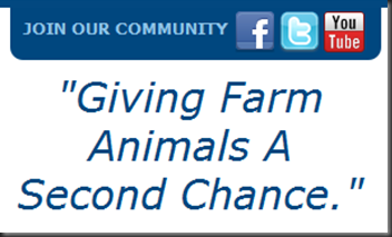
After some fine tuning of the widths, margins and padding, the social / slogan area now looks like the following:
 The area with the social links is tied into the background area at the top. This gives a subtle visual indication that these links are going to lead you away from our site.
The final area in the header is used to provide addition links and a search box. Once again, this content is encapsulated into an ASP.NET MVC partial view:
<div id="links-search">
<div id="links">
<%= Html.ActionLink("Home", "Index", "Home") %> •
<%= Html.ActionLink("Contact Us", "ContactUs", "Contact") %> •
<%
if (Request.IsAuthenticated) {
%>
<span class="text"><b><%= Html.Encode(Page.User.Identity.Name) %></b></span>
<%= Html.ActionLink("Log Off", "LogOff", "Account") %>
<%
}
else {
%>
<%= Html.ActionLink("Log On", "LogOn", "Account") %>
<%
}
%>
</div>
<div id="searcharea">
<img alt="paw prints" src="<%= Url.Content("~/Content/Images/paw_prints.png") %>"/>
<input id="search" type="text" size="21"/>
<a id="searchlink" onclick="searchSite();">
<img alt="search" src="<%= Url.Content("~/Content/Images/search.png") %>"/>
</a>
</div>
</div>
The top division provides an area for links. There may be other links in the future that are added to this area. Therefore the underlying box (head-area-2) has been purposefully oversized to fit future needs. The bottom division is used to supply a search box. The following CSS is used to style this area:
#links-search
{
    float: right;
    font-size: 1.1em;
    text-align: right;
    padding: 9px 13px 12px 13px;
    color: #4c88be;
    background-color: #00477f;
    border-radius: 10px;
    -webkit-border-radius: 10px;
    -moz-border-radius: 10px;
}

#searcharea
{
    margin: 10px 0 3px 0;
}
Nothing too fancy here. The final rendering now looks like the following:
 Because these links direct to internal pages, they are contained within an island that is not tied to the background (a small 3 pixel top and left border that is set by the margin on the “head-area-2” element).
There are a number of great repositories of free icons. Lately, I have been enjoying Icon Finder.
Menu Bar
The menu bar for this site was designed in a previous post. I will not rehash that here. Because there were some minor changes I will post the full HTML and CSS and focus on the difference. Please refer back to the previous post for additional details. The menu bar has been encapsulated into an ASP.NET MVC partial view. The following HTML is rendered by that view:
<div id="menucontainer">
<ul id="nav">
<li>
<a href="#">About Us</a>
<ul>
<li>
<a href="#">What is Hearland?</a>
</li>
<li>
<a href="#">Animal Residents</a>
</li>
<li>
<a href="#">Privacy Policy</a>
</li>
</ul>
</li>
<li>
<a href="#">Programs & Services</a>
<ul>
<li>
<a href="#">Farm Animal Rescue</a>
</li>
<li>
<a href="#">Animal Assisted Activities</a>
</li>
<li>
<a href="#">Resources for Companion Animals</a>
</li>
</ul>
</li>
<li>
<a href="#">Education Center</a>
<ul>
<li>
<a href="#">Heartland News</a>
</li>
<li>
<a href="#">Media Center</a>
</li>
<li>
<a href="#">Links</a>
</li>
</ul>
</li>
<li>
<a href="#">Get Involved</a>
<ul>
<li>
<a href="#">Join Our Online Community</a>
</li>
<li>
<a href="#">Capital Campaign</a>
</li>
<li>
<a href="#">Corporate Sponsorship</a>
</li>
</ul>
</li>
<li>
<a href="#">Shop Online</a>
<ul>
<li>
<a href="#">Animal Sponsorship</a>
</li>
<li>
<a href="#">Commemorative Bricks</a>
</li>
<li>
<a href="#">Farm Animal Fun</a>
</li>
</ul>
</li>
<li id="action">
<a href="#">Donate</a>
<ul>
<li>
<a href="#">Become a Member</a>
</li>
<li>
<a href="#">Donate Now</a>
</li>
<li>
<a href="#">iGive</a>
</li>
</ul>
</li>
</ul>
</div>
Notice the menu bar is simply an un-ordered list. The rendering of this list is controlled via the following CSS:
#menucontainer
{
    overflow: visible;
    background: transparent url(Images/nav_bg.png) repeat-x scroll 0 0;
    border-radius: 10px;
    -webkit-border-radius: 10px;
    -moz-border-radius: 10px;
    margin: 0 10px;
    height: 39px;
}


#nav
{
    display: inline;
    margin: 0;
    padding: 0;
}

#nav li
{
    list-style: none;
    float: left; /* arrange top level items horizontally */
    position: relative;
    border-right: solid 1px #888;
}

#nav a
{
    display: block;
    padding: 11px 25px;
    text-decoration: none;
    color: #fff;
    font-weight: bold;
    font-size: 14px;
    border-radius-topleft: 10px;
    -webkit-border-top-left-radius: 10px;
    -moz-border-radius-topleft: 10px;
    border-radius-topright: 10px;
    -webkit-border-top-right-radius: 10px;
    -moz-border-radius-topright: 10px;
}

#nav li a:hover
{
    background-color: #4c88be;
    color: #000;
}

#nav li#action
{
    background: transparent url(Images/nav_action_bg.png) repeat-x scroll 0 0;
    border-radius-topright: 10px;
    -webkit-border-top-right-radius: 10px;
    -moz-border-radius-topright: 10px;
    border-radius-bottomright: 10px;
    -webkit-border-bottom-right-radius: 10px;
    -moz-border-radius-bottomright: 10px;
    border-right: none;
    float: right;
    width: 153px;
}

#nav li#action a
{
    color: #643f05;
}

#nav li#action a:hover
{
    background-color: #FBD397;
    color: #000;
}

#nav li ul
{
    margin: 0;
    padding: 0;
    position: absolute;
}

#nav li#action ul
{
    right: 0;
}

#nav li ul li
{
    float: none; /* arrange submenus vertically */
    border-top: solid 1px #8dc3e9;
    width: 250px;
}

#nav li ul li a
{
    background: #00477f;
    border-radius: 0;
    -webkit-border-radius: 0;
    -moz-border-radius: 0;
}

#nav li ul li a:hover
{
    background-color: #4c88be;
    color: #000;
}

#nav li#action ul li a
{
    background-color: #fea31a;
}

#nav li#action ul li a:hover
{
    background-color: #FBD397;
    color: #000;
}
This is a lot of CSS, but the payoff is a nice looking menu bar that mimics a drop down menu. Two things are different than the previously discussed menu bar:
- The colors have been adapted to our color theme. An image with a slight gradient is used as the background color.
- The last list item has been given an “action” ID. This is used to add the “orangy” style to the last item.
Here is the final result:
Footer Details
The footer is a much simpler beast. The following is the complete HTML for the footer area:
<div id="footer">
    <div id="contact-info">
        <h5>Contact Info</h5>
        <p>Bob Cravens</p>
        <p>123 South Main Street</p>
        <p>Verona, Wisconsin 53593</p>
        <p>1.234.567.8888</p>
    </div>
    <div id="mission">
        <h5>Mission Statement</h5>
        <p>Pellentesque habitant morbi tristique senectus et netus et malesuada fames ac turpis egestas. Vestibulum tortor quam, feugiat vitae, ultricies eget, tempor sit amet, ante. Donec eu libero sit amet quam egestas semper. Aenean ultricies mi vitae est. Mauris placerat eleifend leo.</p>
    </div>
    <div id="copyright">
        © 2009 Heartland Farm Sanctuary
    </div>
</div>
The new HTML elements simply add realistic content.
There are many textual elements that are not well defined. This is typical and should not stall your design. Inserting placeholders is a great way to keep moving forward. In fact this has been common place in the printing and typesetting industry. There are many text generators that supply meaningless text for this purpose. My favorite is HTML Ipsum.
The CSS to style the footer is also very simple.
#footer
{
    background-color: #00477f;
    color: #fff;
    border-top: solid 1px #4c88be;
    padding: 10px;
    border-radius-bottomleft: 10px;
    -webkit-border-bottom-left-radius: 10px;
    -moz-border-radius-bottomleft: 10px;
    border-radius-bottomright: 10px;
    -webkit-border-bottom-right-radius: 10px;
    -moz-border-radius-bottomright: 10px;
}
Summary
So after a bit of effort, we now have a page header and footer designed. There is still some development to do to get some of the elements to function (for instance search and login). In addition, I am still negotiating the final content of the header and footer regions. I don’t expect the layout to change much. However, the final text in the footer and header along with a background image to help moderate some of the header white space is still forth-coming.


