Downloads: Beta
This plugin is release under dual licenses: MIT License GPL
There are a number of great modal plugins that already exist. Many of them suffer from the following:
- Feature Bloat - Many modal plugins have a lot of features. These additional features make the plugin heavy and complicated to use.
- Styling Issues - Some modal plugins do not separate the CSS for styling the modal from those styles that position the modal.
This beta release has been tested on the following browsers:
- Chrome: Mac 9.0.597.102, Windows 9.0.597.98
- FireFox: Mac 3.6.13, Windows 3.6.12
- Safari: Mac 5.0.3(6533.19.4) Windows 5.0.3(7533.19.4)
- IE: 8.0.7601.17514 (IE7 & IE8 Modes)
I don't anticipate breaking current features, but I have a few configuration options to add before officially releasing. Please feel free to begin using the plugin.
I will eventually move the code to Github or CodePlex. Until then, if you have contributions or feedback, please contact me directly (bob dot cravens at gmail). Otherwise, enjoy the plugin.
API
The API consist of two functions and config object:
Show Modal
$('#someId').doModal(options);
Show the #someId element as a modal.
Close Modal
$.modal.close();
Hide or close the modal.
Modal Options
var options = {
	controlsCssClass: 'controls',		// css class for the element wrapping all buttons
	buttons: [							// an array of buttons
		{
			id: 'btn1',					// button id (optional)
			html: 'Yes',				// content for the button (required)
			cssClass: 'button blue'		// css for the button (optional)
			onclick: function(evt){		// click handler for button (required)
				evt.preventDefault();	// prevent the default action
				/* other processing */	// additional processing
			}
		},
		{ /* other button definitions */ }
	]
}
This object is passed into the doModal function to configure the modal dialog options. The buttons are dynamically generated based upon the configuration data provided.
Examples
Here are a few examples.
Note that these examples use the CSS3 gradient buttons designed by WebDesigner Wall.
Show Dialog
Show DialogModal #1
The buttons & click handlers are options passed into the modal dialog.
HTML
<a id="modal1-link" href="#" class="button green">Show Dialog</a>
<div id="modal1" class="modal">
	<h3>Modal #1</h3>
	<p>The buttons & click handlers are options passed into the modal dialog.</p>
</div>
jQuery
$("#modal1-link").click(function(){

	var options = {
		buttons: [
			{
				html: "Yes",
				cssClass: "button blue",
				onclick: function(evt){
					evt.preventDefault();
					alert("You voted: YES");
					$.modal.close();
				}
			},
			{
				html: "No",
				cssClass: "button red",
				onclick: function(evt){
					evt.preventDefault();
					alert("You voted: NO");
					$.modal.close();
				}
			}
		]
	};
	$("#modal1").doModal(options);
});
CSS
.modal{
    display: none;
    color: #fff;
    background-color: #0f0f0f;
    border: 2px solid #333;
	box-shadow: 0px 0px 25px #333;
	-moz-box-shadow: 0px 0px 25px #333;
	-webkit-box-shadow: 0px 0px 25px #333;
    padding: 5px;
    max-width: 400px;
}
.modal p.controls{
    text-align: right;
    padding: 5px 0 0 0;
}
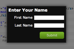
Form Example
Show FormEnter Your Name
HTML
<a id="modal2-link" href="#" class="button blue">Show Form</a>
<div id="modal2" class="modal">
    <h3>Enter Your Name</h3>
    <p>
        <label for="first">First Name</label>
        <input id="first" name="first" type="text" />
    </p>
    <p>
        <label for="last">Last Name</label>
        <input id="last" name="last" type="text" />
    </p>
</div>
jQuery
$("#modal2-link").click(function(evt){
	evt.preventDefault();

	var options = {
			buttons: [
				{
					html: "Submit",
					cssClass: "button green",
					onclick: function(evt){
							evt.preventDefault();

							var first = $("#first").val();
							var last = $("#last").val();
							alert("You entered: " + first + " " + last);
							$.modal.close();
						}
				}
			]
	};
	$("#modal2").doModal(options);
});
CSS
.modal{
    display: none;
    color: #fff;
    background-color: #0f0f0f;
    border: 2px solid #333;
	box-shadow: 0px 0px 25px #333;
	-moz-box-shadow: 0px 0px 25px #333;
	-webkit-box-shadow: 0px 0px 25px #333;
    padding: 5px;
    max-width: 400px;
}
.modal p.controls{
    text-align: right;
    padding: 5px 0 0 0;
}
.modal label{
    width: 100px;
    text-align: right;
    display: inline-block;
}