Building A Web Application – High Level Design
In our last post we secured the web presence necessary to host our web application and establish and build a community around the organization. This post will introduce the high level architecture and design of our web application.
50000 Foot View
The goal is to develop and deploy a web application for a non-profit organization. The web application will evolve over time and will need to support the following:
- A “portal” or “home” page that summarizes the current organization activities. This page is the home page associated with the domain name we registered. This page is a portal because it offers access to other areas of the site (blog, online store, donation center…etc). This page will need to inspire visitors to take further action.
- Blogging engine to allow stories / articles to be published and consumed. Administration and publishing will need to be as easy as possible. For this reason, the intent is to use a well established blogging engine. Content from this blogging engine can be used to feed areas on the home page.
- A secure and professional looking donation center. This will allow inspired visitors to financially support the cause.
There will be other requirements as we evolve. For instance, the ability to publish photos into a gallery of some sort may be of interest. It will be important that the decisions we make now don’t preclude these options in the future.
High Level Home Page Design
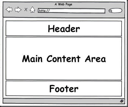
The home page will be coarsely divided into three areas: header, content, and footer. This is pretty standard stuff. The header will provide navigational and main menu options. The header should be clean and provide clear access to all areas of the site.
 The main content area will be further divided based upon what is being shown. Typically this will takes the form of one, two or three columns. The footer is an area that will be used to provide additional information to the user that we want to appear on every page.
Since we are using the ASP.NET MVC framework to develop this site. The header and footer will be contained in a master view and shared among all the other views.
Color Theme
I am not a professional designer. It is much easier for me to recognize sites that are not well designed (you know the ones that look like someone threw up on your screen). I find that a good starting point is to pick a color theme. Again, I am not an expert in color selections. I will leverage an online tool that helps with this selection. For instance color combos is a good site to get started. This site allows you to view a number of color themes. We are selecting the “ColorCombo267” for my theme. The following are the colors along with the hex values:
The site will mostly leverage the blues and will be highlighted with the other colors. There may be additional colors that enter into the web site design. However, the goal is keep the theme as clean as possible with a minimal selection of colors.
Refactoring the Default ASP.NET MVC Application
To get going start up Visual Studio 2008 and create an ASP.NET MVC web application. Phil and friends have been kind enough to stub in an application for us. The first thing that we will do is refactor the auto-generated files. This refactoring will be guided by the YAGNI philosophy. I will remove all unnecessary code until it proves necessary.
The refactored “Site.css” file looks like this when we are done:
/* CSS Reset
----------------------------------------------------------*/
html, body, div, span, applet, object, iframe,
h1, h2, h3, h4, h5, h6, p, blockquote, pre,
a, abbr, acronym, address, big, cite, code,
del, dfn, em, font, img, ins, kbd, q, s, samp,
small, strike, strong, sub, sup, tt, var,
b, u, i, center,
dl, dt, dd, ol, ul, li,
fieldset, form, label, legend,
table, caption, tbody, tfoot, thead, tr, th, td {
    margin: 0;
    padding: 0;
    border: 0;
    outline: 0;
    font-size: 100%;
    vertical-align: baseline;
    background: transparent;
}

/* BODY
----------------------------------------------------------*/
body
{
    font-size: .75em;
    font-family: Verdana, Helvetica, Sans-Serif;
    color: #696969;
    background: #fff url(Images/body_bg.gif) repeat-x scroll 0 0;
}

/* HEADINGS
----------------------------------------------------------*/
a
{
    outline: none;
}

a:link
{
    color: #fea31a;
    text-decoration: underline;
}

a:visited
{
    color: #FBD397;
}

a:hover
{
    color: #FBD397;
    text-decoration: none;
}

a:active
{
    color: #12eb87;
}


/* HEADINGS
----------------------------------------------------------*/
h1
{
    font-size: 2em;
}
h2
{
    font-size: 1.5em;
}
h3
{
    font-size: 1.2em;
}
h4
{
    font-size: 1.1em;
}
h5, h6
{
    font-size: 1em;
}

/* MISC
----------------------------------------------------------*/
.clear
{
    clear: both;
}
To minimize cross browser differences it is important we normalize the browsers using a “css reset” of some sort. There are many out there. I am using a modified version of the one found here. The “CSS reset” should be placed at the top of the file. This will save us a tremendous amount of pain trying to achieve pages that render nearly the same in all browsers.
I kept a couple of other CSS styles that are defined in the default ASP.NET MVC project. Even in the ones I kept, I removed many of the attributes. I also introduced some color selection in the body (background image) and default anchors.
![]() I created the background image for the page in Paint.NET by creating a canvas that is 1 x 1210 pixels (a long thin image). I then selected the primary color as #00477f (the dark blue in my color theme) and the secondary color as white. Using the gradient tool, I create a gradient from the top (blue) to the bottom (white). This image provides a nice back drop for the page that fades to white at the bottom. You can see a screen shot of this fade in the image at the left.
I created the background image for the page in Paint.NET by creating a canvas that is 1 x 1210 pixels (a long thin image). I then selected the primary color as #00477f (the dark blue in my color theme) and the secondary color as white. Using the gradient tool, I create a gradient from the top (blue) to the bottom (white). This image provides a nice back drop for the page that fades to white at the bottom. You can see a screen shot of this fade in the image at the left.
The image to the right is a color swatch for the “active colors”. I wanted something that was going to stand out and call for action. After investigating many non-profit web sites they tend to use an orange color for these action links. I have initially set all anchors to have a deep rich orange for normal color and a lighter orange for hover-overs.
Next, I gutted the “Site.Master” that is generated with the default ASP.NET MVC application to include only the elements that I know I will need. This file now looks like the following:
<body>
    <div class="page">

        <div id="header">
        </div>

        <div id="main">
            <asp:ContentPlaceHolder ID="MainContent" runat="server" />
        </div>

        <div id="footer">
        </div>
    </div>
</body>
I will leave the rest of the auto-generated code (controllers and other views) for now. They are not in the way of the code that I want to work on first. So now, we have a fairly clean solution to get us started.
Summary
So far we have been doing a lot of preparation to get ready for this project. Preparation is a key practice to reduce the amount of waste that we do in our development. At this point we have an empty site that is well prepared for adding our content.
I have not included (and don’t intend on including) any discussion on engineering best practices (like using source control, test (or behavior) driven development) or project management (waterfall or scrum). These tend to be almost religious type discussions. My goal in the posts is to provide enough design / development information that the reader can reproduce my steps. Please use what ever engineering practices / project management that you would like.
Next time we will provide details on the design of the page header.


Thank you for the auspicious writeup. It in reality was a enjoyment account it. Look advanced to far delivered agreeable from you! However, how could we keep up a correspondence?